Los Angeles covid data cooks the books (VIII)

It's been a while since I've posted. The difference between the daily press release numbers (the "we heard about these deaths today" numbers) and the carefully placed dashboard numbers (the "we did the work, and this is the day on the death certificate" numbers) remains widespread. It's been running around 13% pretty much every day now, and the graph looks like this:

Since I last posted, I found another data page. This one is corona-virus.la, and is supposed to be the city's data tracker. They also list the county side-by-side. This is from today:

The first thing to notice is that the city numbers are much smaller than the county. For cases, the city of LA is only 38% of the county, and 28% of the deaths. Of course, we are waiting for the whole, massive county, instead of relying on the city data. Here's a map of the city and county:

The second thing to notice is more subtle. Looking at the numbers for the county, they perfectly match the raw press release numbers. In other words, they are relying on the bad "we heard about it" data, not the clean death-certificate data.

How much difference does that make? If you go to the county dashboard (which is on publichealth.lacounty.gov), you can download the data. Because this data is carefully placed, you do have to wait a couple of days for the data to get cleaned. But up there on the graphic above is the data from the week of 9/13 - 9/19: 11, 24, 37, 31, 38, 22, and 13. That averages to 26.6. But if you look at the same dates on the dashboard, you get: 19, 14, 16, 18, 14, 11, 11. Which averages to 14.7

That's an overstatement of 83%.

Because they are looking at bad data, they are looking at numbers 83% higher than the good data that they also have. This isn't the case of hand-waving statistics that shouldn't be used in that way: this is literally about using the data that they have carefully vetted and maintained, instead of the data that they know and admit is bad.

If you go to the dashboard (publicheath.lacounty.gov), you'll note a gray area on the right and some footnotes on the graph:

Those footnotes might be a bit small, but they say:

Recent dates are incomplete due to lags in reporting. The gray box corresponds to dates that are likely to not yet be reported completely.

Cases reported by Episode Date which is the earliest existing value of: Date of Onset, Date of Diagnosis, Date of Death, Date Received, Specimen Collection Date. Deaths reported by Date of Death or Date Received if Date of Death is missing

Number of daily cases will not match the number of newly reported Los Angeles County cases as episode date reflects date of underlying illness rather than date of report.

So, if we look only at the dates to the left of the gray area, we have everything including 9/20. If we look at the average for the week ending 9/20 and the prior week we have averages of: 22.4 and 13.3, with a decrease of -40.6%. On corona-virus.la (the one above with the column graphs) what do they have for the change in from the previous to the current week? +8.1%.

I can not begin to say how much using the wrong numbers is pissing me off. Businesses are being destroyed--lives are being destroyed--every single day we remain closed down at a high level of lockdown.

Los Angeles covid data cooks the books (VII)

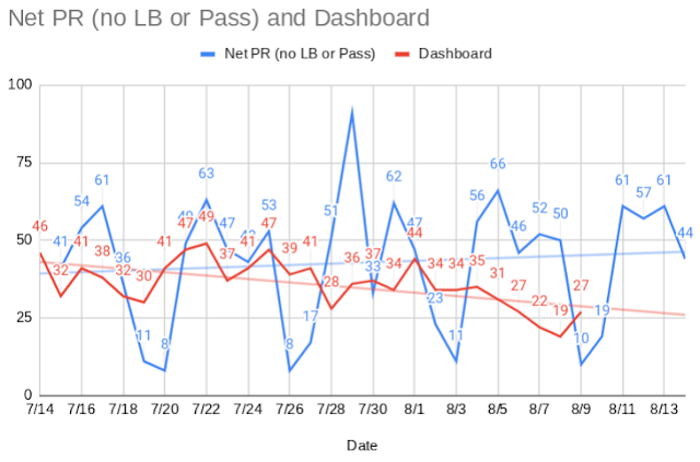
 I'm continuing to track the press release numbers versus the more careful dashboard numbers for LA County (minus Long Beach and Pasadena). Currently, the press releases since July 15th has overstated the number of deaths by 15%, and over the last two weeks by 21.7%.

I've also graphed it. Notice the trendlines:

Again, blue is the press release and red is the more-careful dashboard. Notice the trendlines. The headline grabbing press release numbers, those numbers that get repeated in the news, are on the upswing, but the actual numbers are dropping fairly dramatically. A month ago, deaths in LA were around 40 a day, now they're down under 30, while the press releases show an increase of a few a day. The difference between the two trendlines is now around 33% (28 vs 37 on 8/9 (the last day outside the estimate range on the dashboard)).

Who decides on reopening

The Recession Is Over for the Rich, But the Working Class Is Far from Recovered

“The recession is nearly over for high-wage workers, but low-wage workers are no more than half-recovered,” said Friedman, who led the research, which is sponsored by Harvard and Brown universities and the Bill & Melinda Gates Foundation.

When Governor Newsom created his reopening task force, he staffed it with high executives of major companies, former big-name politicians (good lord, recalled Gray Davis made the cut!) environmental and political activists, and union bosses. I doubt, highly doubt, anyone on the list had a household income under $400k or a net worth under $3mil, nor were any merely high school graduates, or--heaven forbid--drop outs. There wasn't one gardener, waitress, manufacturing laborer, check-out clerk, minimum-wage earner, or small business owner. It was all big names and flashy resumes. (Read the list for yourself.)

Now, here we are four months later, and those people who were unrepresented on that task force are still ordered to be poor and desperate--they're losing their businesses and homes, and their children will lose a year of education with all the lifetime of poverty that comes with that--while all the people in the task-force's class are working and getting paid, and their kids all have parents with the education or money to actually move forward academically this year.

Funny how that works, huh?

It comes down to the question of who decides. In a technocratic world, the well educated and well placed get the freedom to choose, everyone else gets told what to do--and gets screwed.

I doubt it even crossed Newsom's mind, or the mind of anyone else on the task force, to seek a diversity of employment, education, wages, or class. They assume they should rule, because they are wealthier and better credentialed. 

It's the modern aristocracy claiming their right to power.

Covid negative

 I was feeling a little under the weather last week: slight sniffles, bit of a headache, maybe a little sore throat; but, since I work in healthcare adjacent and at a hospital, I had to call the employee health line. They told me to get my brain reamed. 

 I went in yesterday morning to have  q-tip shoved up my nose and twirled. It actually wasn't bad, though if it had gone on much longer, it might have been. The worst was the nurse saying it could make my brain hurt for maybe an hour! Yay! Within about 15 minutes, any after effects had disappeared.

They just called, I'm clear.

Boss asked if I wanted to work from home the rest of the week anyway. I do still have something, and if someone else caught it, they'd have to go through the same thing, so home it is.

Los Angeles covid data cooks the books (VI)


Running Total Press Release: 633
Running Total Dashboard: 485
Total Decrease: 148
Total % Decrease: 23%

July 29: LADPH stated openly that the press release included backlogged data. That data would result in corrections to the dashboard as the deaths get properly attributed to the date of death, not the date the report reached the LADPH.
Press release deaths: 91 (with 0 of those in Long Beach and 0 in Pasadena)
LB & Pas removed: 91
Final dashboard deaths*: 30
Reduction: 61
% Reduction: 67%

July 28:
Press release deaths: 51 (with 0 of those in Long Beach and 0 in Pasadena)
LB & Pas removed: 51
Final dashboard deaths*: 20
Reduction: 31
% Reduction: 61%

July 27:
Press release deaths: 17 (with 0 of those in Long Beach and 0 in Pasadena)
LB & Pas removed: 17
Final dashboard deaths*: 30
Increase: -13
Increase: 77%

July 26:
Press release deaths: 10 (with 2 of those in Long Beach and 0 in Pasadena)
LB & Pas removed: 8
Final dashboard deaths*: 29
Increase: -21
Increase: 263%

July 25:
Press release deaths: 53 (with 0 of those in Long Beach and 0 in Pasadena)
LB & Pas removed: 53
Final dashboard deaths*: 36
Reduction: 17
% Reduction: 32%

July 24:
Press release deaths: 44 (with 0 of those in Long Beach and 1 in Pasadena)
LB & Pas removed: 43
Final dashboard deaths*: 37
Reduction: 6
% Reduction: 14%

July 23:
Press release deaths: 49 (with 1 of those in Long Beach and 1 in Pasadena)
LB & Pas removed: 47
Final dashboard deaths*: 28
Reduction: 19
% Reduction: 40%

July 22:
Press release deaths: 64 (with 1 of those in Long Beach and 0 in Pasadena)
LB & Pas removed: 63
Final dashboard deaths*: 38
Reduction: 25
% Reduction: 40%

July 21:
Press release deaths: 50 (with 1 of those in Long Beach and 0 in Pasadena)
LB & Pas removed: 49
Final dashboard deaths*: 40
Reduction: 9
% Reduction: 18%

July 20:
Press release deaths: 9 (with 0 of those in Long Beach and 1 in Pasadena)
LB & Pas removed: 8
Final dashboard deaths*: 37
Increase: 29
% Increase: 363%


July 19:
Press release deaths: 11 (with 0 of those in Long Beach and 0 in Pasadena)
LB & Pas removed: 11
Final dashboard deaths*: 28
Increase: 17
% Increase: 155%


July 18:
Press release deaths: 37 (with 1 of those in Long Beach and 0 in Pasadena)
LB & Pas removed: 36
Final dashboard deaths*: 31
Reduction: 5
% Reduction: 14%

July 17:
Press release deaths: 62 (with 1 in Long Beach and 0 in Pasadena)
LB & Pas removed: 61
Final dashboard deaths: 31
Reduction: 30
% Reduction: 49%

July 16:
Press release deaths: 59 (with 5 in Long Beach and 0 in Pasadena)
LB & Pas removed: 54
Final dashboard deaths: 40
Reduction: 14
% Reduction: 26%

July 15:
Press release deaths: 44 (with 2 of those in Long Beach and 1 in Pasadena)
LB & Pas removed: 41
Final dashboard deaths: 30
Reduction: 11
% Reduction: 27%

Los Angeles covid data cooks the books (V)

July 28 is the last day so far with solid data. On July 29th the press release stated they included a large number of backlogged deaths. That should be reflected in the dashboard numbers below.

Running Total Press Release: 542
Running Total Dashboard: 455
Total Decrease: 87
Total % Decrease: 16%

July 28:
Press release deaths: 51 (with 0 of those in Long Beach and 0 in Pasadena)
LB & Pas removed: 51
Final dashboard deaths*: 20
Reduction: 31
% Reduction: 61%

July 27:
Press release deaths: 17 (with 0 of those in Long Beach and 0 in Pasadena)
LB & Pas removed: 17
Final dashboard deaths*: 30
Increase: -13
Increase: 77%

July 26:
Press release deaths: 10 (with 2 of those in Long Beach and 0 in Pasadena)
LB & Pas removed: 8
Final dashboard deaths*: 29
Increase: -21
Increase: 263%

July 25:
Press release deaths: 53 (with 0 of those in Long Beach and 0 in Pasadena)
LB & Pas removed: 53
Final dashboard deaths*: 36
Reduction: 17
% Reduction: 32%

July 24:
Press release deaths: 44 (with 0 of those in Long Beach and 1 in Pasadena)
LB & Pas removed: 43
Final dashboard deaths*: 37
Reduction: 6
% Reduction: 14%

July 23:
Press release deaths: 49 (with 1 of those in Long Beach and 1 in Pasadena)
LB & Pas removed: 47
Final dashboard deaths*: 28
Reduction: 19
% Reduction: 40%

July 22:
Press release deaths: 64 (with 1 of those in Long Beach and 0 in Pasadena)
LB & Pas removed: 63
Final dashboard deaths*: 38
Reduction: 25
% Reduction: 40%

July 21:
Press release deaths: 50 (with 1 of those in Long Beach and 0 in Pasadena)
LB & Pas removed: 49
Final dashboard deaths*: 40
Reduction: 9
% Reduction: 18%

July 20:
Press release deaths: 9 (with 0 of those in Long Beach and 1 in Pasadena)
LB & Pas removed: 8
Final dashboard deaths*: 37
Increase: 29
% Increase: 363%


July 19:
Press release deaths: 11 (with 0 of those in Long Beach and 0 in Pasadena)
LB & Pas removed: 11
Final dashboard deaths*: 28
Increase: 17
% Increase: 155%


July 18:
Press release deaths: 37 (with 1 of those in Long Beach and 0 in Pasadena)
LB & Pas removed: 36
Final dashboard deaths*: 31
Reduction: 5
% Reduction: 14%

July 17:
Press release deaths: 62 (with 1 in Long Beach and 0 in Pasadena)
LB & Pas removed: 61
Final dashboard deaths: 31
Reduction: 30
% Reduction: 49%

July 16:
Press release deaths: 59 (with 5 in Long Beach and 0 in Pasadena)
LB & Pas removed: 54
Final dashboard deaths: 40
Reduction: 14
% Reduction: 26%

July 15:
Press release deaths: 44 (with 2 of those in Long Beach and 1 in Pasadena)
LB & Pas removed: 41
Final dashboard deaths: 30
Reduction: 11
% Reduction: 27%

NEJM should know better

I was just following a bunch of links on reopening the schools, and landed on this article:

"Reopening Primary Schools during the Pandemic" (Meira Levinson, D.Phil., Muge Cevik, M.D., and Marc Lipsitch, D.Phil.)  (DOI: 10.1056/NEJMms2024920 [and may I say, the invention of the DOI system is one of the greatest gifts to mankind!])

In the article is this:

Furthermore, even when they are in the building, teachers may struggle to teach and students may struggle to learn under rigorous social distancing conditions. Young children cannot reliably maintain physical distance, and teachers cannot simultaneously enforce distancing and teach. In-person classes that require students to look straight ahead and work independently (as many proposals for distanced classrooms recommend) violate evidence-based good teaching practices.(17)


Knowing that looking straight ahead and working independently does not violate  evidence-based good teaching practices, but only violates what teachers are erroneously taught in ed schools, I followed footnote #17 to...and opinion piece published in the Washington Post.

No evidence in sight!

"Perspective | The case against reopening schools during the pandemic — by a fifth-grade teacher" Authored by Valerie Strauss, but with the "Perspective" coming from fifth grade teacher Rose Levine.

Here's her "evidence-based" claims...oh, wait, she didn't give any! Just her perceptions and her "perspective" of her classroom:

Sharing a classroom allows our elementary cohorts to become like family. We play games, exchange smiles, sit in circles on the rug and tell stories. We taste each other’s food and whisper in each other’s ears. We have casual exchanges during downtimes at recess or transitions between subjects. We share supplies, collaborate and take turns, and in so doing we build a model of accountability to one another and our community.


Evidence!

This is my favorite part of the piece, where she's complaining about the physical distancing which would be required in reopened schools:

A student experiencing abuse at home can’t find a way to share that information with a trusted adult without the whole class overhearing.


So, think about that one a little logically: a student is being abused at home, so we must keep them there, because at school they wouldn't be able to tell anyone about it. Okay...yeah, I don't get that one. 

Then there's this, which is about the closest the article comes to the point the NEJM authors were using the footnote for:
Because we know that students learn best when they collaborate with peers, discuss their thinking aloud, and experience instruction tailored to exactly the skills they need to learn next.


How does Ms Levine know that? Because that's probably what she was taught in ed school and at every teacher's training session she's ever been too. In the ed world, student-centered classrooms are a given, and anything that contradicts that is an anathema.

The NEJM should have actually linked to another journal as evidence, if they could. But actual journal articles supporting student-centered learning are few and far between. The evidence is mostly on the other side. Which leads us to the arguments in the ed world about scientific studies being bad, because they don't say what they know to be true, and there are other ways of knowing, you know.

I find it astounding that this "perspective" was used to bolster a NEJM piece. A peer-reviewed, scientific journal, and one with a strong international reputation like the New England Journal of Medicine, should do better than a footnote linking to an opinion. Especially when they claim it's to "evidence".

But, then, NEJM authors aren't education experts, so a WaPo op ed sounded good enough to them.

Oh, wait, one of the authors is at the Harvard Graduate School of Education!

He should certainly have known better, and had at his fingertips the journal articles that would have actually supported his point. Huh. I find it interesting that he linked to an op-ed instead then. Maybe because the "evidence-based" science doesn't actually back his point. Which gets me back to ed schools teaching the wrong thing to our teachers.

Of course, that link weakened their case and made them look like twits to the one person in the entire world who would actually follow their footnote (Who? Me?)

When it comes to collaborative, student-centered, constructivist-style teaching, I love what happened with the PISA exam (PISA is a series of exams given internationally, and one of the only ways to compare the educational systems in different countries.)

So convinced were they that student-centered ed systems would do better, that they announced they would track it.

Would schools that used old-fashioned, lecture/response, sitting in neat little lines schools do worse than energetic, project-based, collaboration-based, student-centered (no lecture please!) systems?

When the evidence came back for the traditional old way, they quickly dropped the subject and moved on. There's a lot of moving on in the ed world.

(Greg Ashman's write-up of the PISA experiment.)

Los Angeles covid data cooks the books (V)

Running Total Press Release: 262
Running Total Dashboard: 188
Total Decrease: 74
Total % Decrease: 28%

July 21:
Press release deaths: 50 (with 1 of those in Long Beach and 0 in Pasadena)
LB & Pas removed: 49
Final dashboard deaths*: 34
Reduction: 15
% Reduction: 31%

July 20:
Press release deaths: 9 (with 0 of those in Long Beach and 1 in Pasadena)
LB & Pas removed: 8
Final dashboard deaths*: 24
Increase: 16
% Increase: 200%


July 19:
Press release deaths: 11 (with 0 of those in Long Beach and 0 in Pasadena)
LB & Pas removed: 11
Final dashboard deaths*: 19
Increase: 8
% Increase: 73%


July 18:
Press release deaths: 39 (with 1 of those in Long Beach and 0 in Pasadena)
LB & Pas removed: 38
Final dashboard deaths*: 27
Reduction: 11
% Reduction: 29%

July 17:
Press release deaths: 62 (with 1 in Long Beach and 0 in Pasadena)
LB & Pas removed: 61
Final dashboard deaths: 24
Reduction: 37
% Reduction: 61%

July 16:
Press release deaths: 59 (with 5 in Long Beach and 0 in Pasadena)
LB & Pas removed: 54
Final dashboard deaths: 34
Reduction: 20
% Reduction: 37%

July 15:
Press release deaths: 44 (with 2 of those in Long Beach and 1 in Pasadena)
LB & Pas removed: 41
Final dashboard deaths: 26
Reduction: 15
% Reduction: 37%

Los Angeles covid data cooks the books (IV)

Running Total Press Release: 213
Running Total Dashboard: 153
Total Decrease: 60
Total % Decrease: 29%

July 20:
Press release deaths: 9 (with 0 of those in Long Beach and 1 in Pasadena)
LB & Pas removed: 8
Final dashboard deaths*: 23
Increase: 15
% Increase: 188%


July 19:
Press release deaths: 11 (with 0 of those in Long Beach and 0 in Pasadena)
LB & Pas removed: 11
Final dashboard deaths*: 19
Increase: 8
% Increase: 73%


July 18:
Press release deaths: 39 (with 1 of those in Long Beach and 0 in Pasadena)
LB & Pas removed: 38
Final dashboard deaths*: 27
Reduction: 11
% Reduction: 29%

July 17:
Press release deaths: 62 (with 1 in Long Beach and 0 in Pasadena)
LB & Pas removed: 61
Final dashboard deaths: 24
Reduction: 37
% Reduction: 61%
 
July 16:
Press release deaths: 59 (with 5 in Long Beach and 0 in Pasadena)
LB & Pas removed: 54
Final dashboard deaths: 34
Reduction: 20
% Reduction: 37%

July 15:
Press release deaths: 44 (with 2 of those in Long Beach and 1 in Pasadena)
LB & Pas removed: 41
Final dashboard deaths: 26
Reduction: 15
% Reduction: 37%

Los Angeles covid data cooks the books (III)

July 19 actually understated the finalized deaths. More also are getting attributed to the other dates below, so the numbers have pulled back slightly. Still, most days are overstating by 30-40%.

July 19:
Press release deaths: 11 (with 0 of those in Long Beach and 0 in Pasadena)
LB & Pas removed: 11
Final dashboard deaths*: 18
Increase: 7
% Increase: 64%


July 18:
Press release deaths: 39 (with 1 of those in Long Beach and 0 in Pasadena)
LB & Pas removed: 38
Final dashboard deaths*: 25
Reduction: 13
% Reduction: 34%

July 17:
Press release deaths: 62 (with 1 in Long Beach and 0 in Pasadena)
LB & Pas removed: 61
Final dashboard deaths: 22
Reduction: 39
% Reduction: 64%

July 16:
Press release deaths: 59 (with 5 in Long Beach and 0 in Pasadena)
LB & Pas removed: 54
Final dashboard deaths: 32
Reduction: 22
% Reduction: 41%

July 15:
Press release deaths: 44 (with 2 of those in Long Beach and 1 in Pasadena)
LB & Pas removed: 41
Final dashboard deaths: 26
Reduction: 15
% Reduction: 37%

Los Angeles covid data cooks the books (II)

The numbers are in now for the 18th, with revisions for the other days as well:

July 18:
Press release deaths: 39 (with 1 of those in Long Beach and 0 in Pasadena)
LB & Pas removed: 38
Final dashboard deaths*: 24
Reduction: 14
% Reduction: 37%

July 17:
Press release deaths: 62 (with 1 in Long Beach and 0 in Pasadena)
LB & Pas removed: 61
Final dashboard deaths: 23
Reduction: 38
% Reduction: 62%
 
July 16:
Press release deaths: 59 (with 5 in Long Beach and 0 in Pasadena)
LB & Pas removed: 54
Final dashboard deaths: 30
Reduction: 24
% Reduction: 44%

July 15:
Press release deaths: 44 (with 2 of those in Long Beach and 1 in Pasadena)
LB & Pas removed: 41
Final dashboard deaths: 25
Reduction: 16
% Reduction: 39%

Los Angeles covid data cooks the books

(Wow, over 2 years since we posted. I suppose it's time.)

Every day here in LA, like pretty much everywhere, the county health officials get up in front of the cameras and talk about the latest covid data. Look how many have just died!!! they trumpet, and the press repeats that number on the nightly news and in their headlines. 59! 62! Horrible! Panic everyone!

Then...about a week later, the county solidifies its data on a dashboard, and that top headline number has, low and behold!, shrunk by 40%, 50%,  or more.

Let's go to the three latest dates that they have more-or-less final data: July 15-17.

July 15:
Press release deaths: 44 (with 2 of those in Long Beach and 1 in Pasadena)
LB & Pas removed: 41
Final dashboard deaths*: 23
Reduction: 18
% Reduction: 44%

July 16:
Press release deaths: 59 (with 5 in Long Beach and 0 in Pasadena)
LB & Pas removed: 54
Final dashboard deaths: 30
Reduction: 24
% Reduction: 44%

July 17:
Press release deaths: 62 (with 1 in Long Beach and 0 in Pasadena)
LB & Pas removed: 61
Final dashboard deaths: 22
Reduction: 39
% Reduction: 64%
Now, these numbers continue to change a bit, but that headline number from last Friday, the one everyone hears on the news, isn't even close to the finalized number--the real number was only a third of the original number.

Sources:

LA Dept of Heath website: http://publichealth.lacounty.gov/

Dashboard: http://dashboard.publichealth.lacounty.gov/covid19_surveillance_dashboard/

Archived press releases: http://publichealth.lacounty.gov/phcommon/public/media/mediapubdisplay.cfm?unit=media&ou=ph&prog=media

* The dashboard does not include Long Beach or Pasadena, that's why I'm removing those from the calculations.